Here’s something most people never think about: the color of your window treatment affects how the entire room feels, not just how the window looks. Get the color right, and the room feels calm, pulled together, and spacious. Get it wrong, and even the most expensive fabric will look out of place. Color is one of the most powerful tools in any modern design window in Columbus project, yet it’s also one of the most misunderstood.
This post breaks down the exact color choices that work, why they work, and how a professional approach to color can completely change what your windows do for a room.
Why Color Is the Foundation of Every Window Design Decision
Before fabric type, before hardware finish, before anything else, color sets the tone. A warm cream shade reads completely differently than a cool white one, even in the same room. One adds softness and warmth; the other can feel stark or flat depending on the light.
A seasoned Window Design Expert Columbus always starts the color conversation early. That’s because window treatments cover a significant portion of a wall, especially in rooms with large or multiple windows. Whatever color you choose will interact constantly with your wall color, your flooring, your furniture, and the natural light coming in throughout the day. It’s not a small decision.
The Core Colors That Drive Modern Window Design
Modern doesn’t mean cold or colorless. It means intentional. The colors that consistently work best in modern design window styling share one quality: they feel calm without being boring.
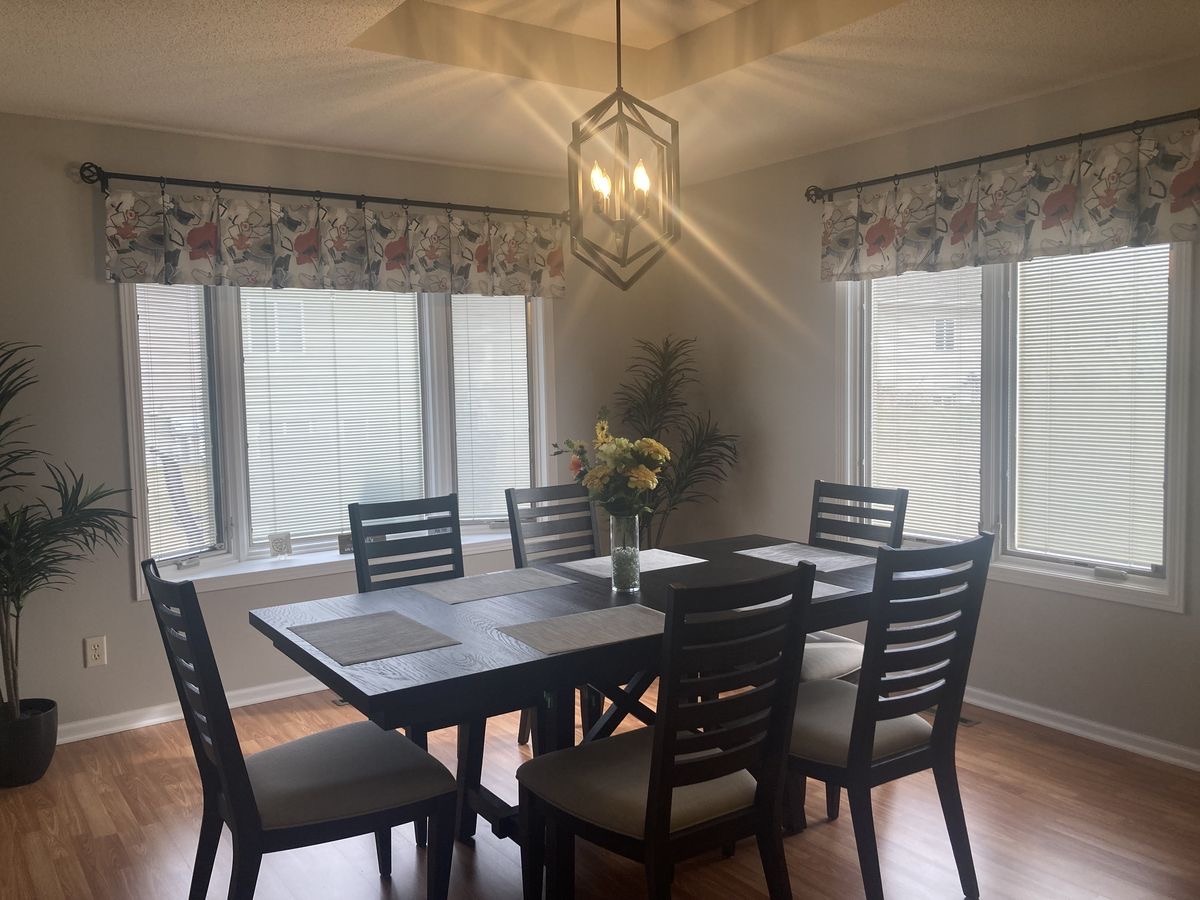
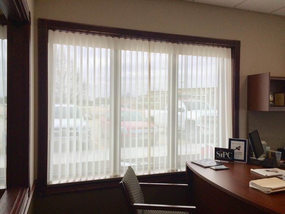
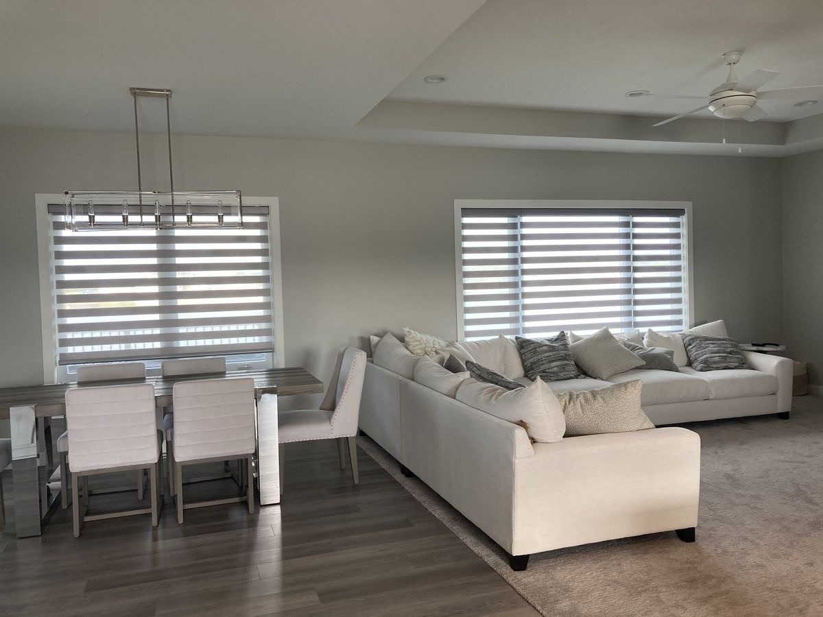
Warm White and Soft Off-White
Warm white is the workhorse of modern window design. It brightens a room without making it feel sterile, and it pairs effortlessly with almost any wall color or furniture tone. Soft off-whites, like warm ivory or cream, add just a touch more depth, making them especially useful in rooms that already have cool-toned walls or flooring. These shades recede into the background, letting other elements in the room take the lead.
Warm Gray and Greige
Warm gray sits right between beige and gray, which is exactly why it works so well. It’s neutral without being flat, and it adds a quiet sophistication to any space. Greige tones, a blend of gray and beige, have become one of the most popular choices in contemporary Columbus homes because they work equally well in traditional and modern interiors. They don’t compete with bold furniture or artwork; they support everything around them.
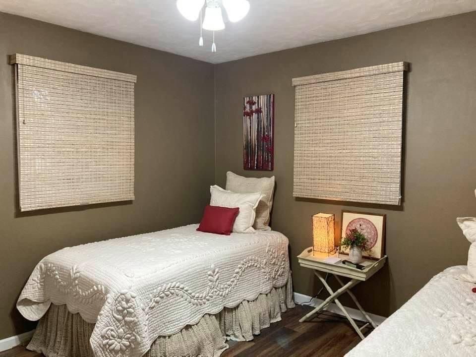
Natural Linen and Soft Sand
These tones bring the feeling of natural materials into a room without relying on pattern or texture alone. Soft sand and linen-inspired shades read as organic and grounded. They’re warm enough to prevent a room from feeling too minimal or cold, yet neutral enough to blend seamlessly into almost any color scheme. A window design expert in Columbus will often recommend these for living rooms and bedrooms where comfort and calm are the priority.
Muted Sage and Dusty Green
Soft, muted greens have steadily grown in popularity for window treatments, especially in spaces that incorporate natural materials like wood, rattan, or stone. These tones add color without loudness, and they bring a subtle connection to nature that fits perfectly within modern interior design thinking. Used as a drape or panel, a dusty sage tone adds character to an otherwise all-neutral room.
What Colors to Avoid in a Modern Window Design
Just as important as knowing what works is knowing what doesn’t. Very bright, saturated colors tend to date quickly and draw too much attention to the window itself rather than the room as a whole. Heavy patterns, while not strictly a color issue, often create the same problem.
Cool, stark whites can work in very specific settings, but in most Columbus homes, they read as clinical rather than clean. The goal of a great modern design window in Columbus approach is always to make the treatment feel like it belongs, not like it arrived from a different room entirely.
Matching Window Treatment Color to Your Existing Interior
Choosing a color in isolation is one of the most common mistakes homeowners make. A treatment needs to work with what’s already in the room, not just look good on its own.
The most reliable approach is to pull a color that already exists somewhere in the room and use it as a reference point. If your sofa is a warm caramel tone, a soft sand or linen shade will feel connected to the space. If your walls are a cool light gray, a warm greige treatment will add balance. This kind of color harmony is what makes a room feel designed rather than assembled.
Stop Guessing at Color and Start Getting It Right
Jolene’s Interiors takes the guesswork out of this entirely. As a trusted window design expert in Columbus, the team understands how color, fabric, and light work together in real homes across the area. Whether you’re drawn to warm neutrals, soft naturals, or want to bring in a quiet pop of muted color, Jolene’s Interiors helps you choose treatments that feel right from every angle and in every light. If your windows deserve a Modern Design Window Columbus that actually fits your home, reach out to Jolene’s Interiors today and get the color conversation started the right way.
Frequently Asked Questions
Q1. What colors work best for a modern design window in Columbus homes?
A1. Warm whites, soft greiges, natural linen tones, and muted sages are the most reliable choices for a modern design window in Columbus. These shades stay neutral, adapt well to different light conditions, and pair easily with a wide range of interior styles.
Q2. Should window treatments match the wall color or contrast with it?
A2. Neither extreme works best on its own. Treatments that match the wall too closely can disappear, while strong contrast can feel jarring. A window design expert in Columbus typically recommends staying within the same tonal family but going one or two shades lighter or warmer than the wall color for a balanced, layered look.
Q3. How does natural light affect window treatment color choices?
A3. Significantly. North-facing rooms benefit from warmer tones to counteract cool light, while south-facing rooms handle slightly cooler neutrals better. A professional window design expert always considers the direction your windows face before recommending a color.
Q4. Can I use color in my window treatments without making the room feel too busy?
A4. Yes, as long as you stay in the muted or dusty range rather than saturated or bright tones. Soft sage, warm terracotta, or dusty blue all add color without visual noise. These work especially well as drapes layered over a neutral shade.